Context
Investors don't only work from their desks. They're in meetings with founders, at conferences, traveling between cities.
Yet they need instant access to critical information: key numbers before a pitch meeting, deal status while en route to committee, portfolio company details before calling the founder.
Our challenge was to condense all the richness and complexity of the desktop platform into a mobile experience that remains powerful and productive, without resembling a miniaturized and frustrating version of the main product.
Problem & objectives
Users told us: 'I love Edda, but when I'm traveling, I'm forced to go back to my spreadsheets to quickly access numbers.' This was an existential problem: if our platform wasn't mobile-accessible, we couldn't become the reference system for our users.
The constraint was clear: we couldn't simply shrink the desktop. A mobile screen demands a different information hierarchy, touch-adapted interactions, and above all, a fine understanding of mobile versus desktop use cases.
Our objectives:
Identify critical mobile use cases and optimize them specifically
Create an information architecture that prioritizes the essential on small screens
Maintain platform power without sacrificing simplicity
Ensure perfect synchronization between mobile and desktop
Solution description
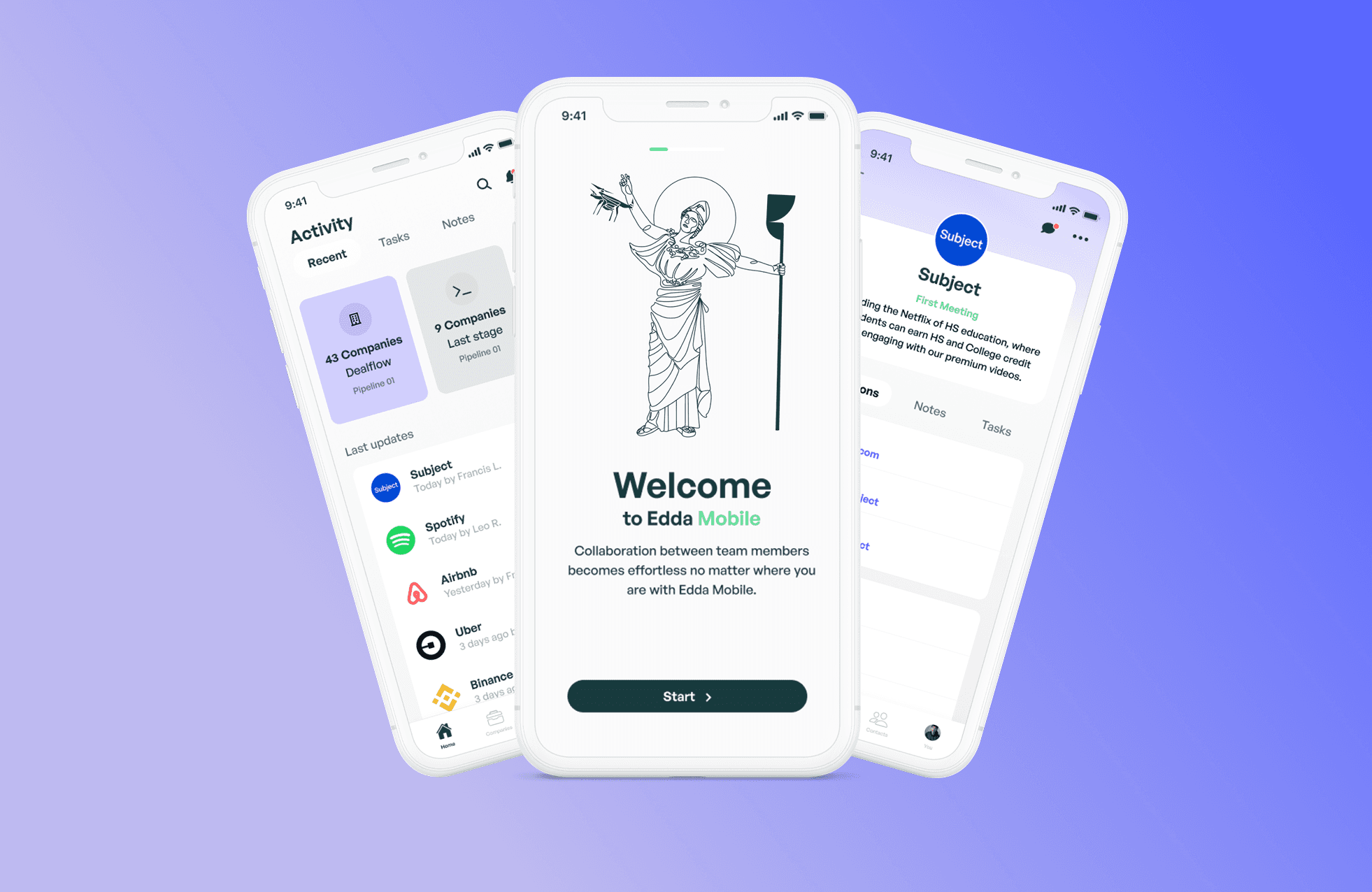
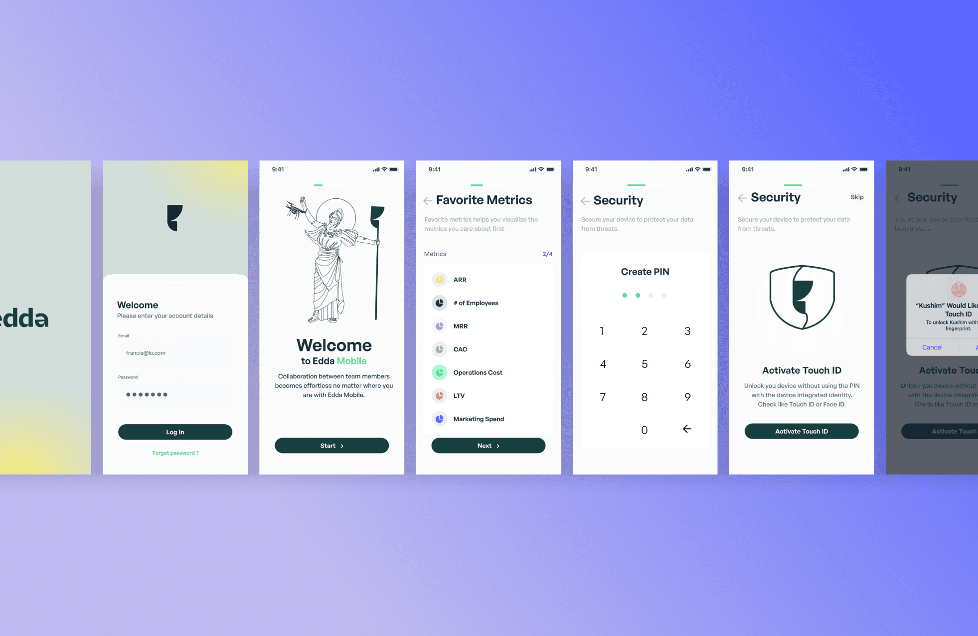
Mobile-first use cases
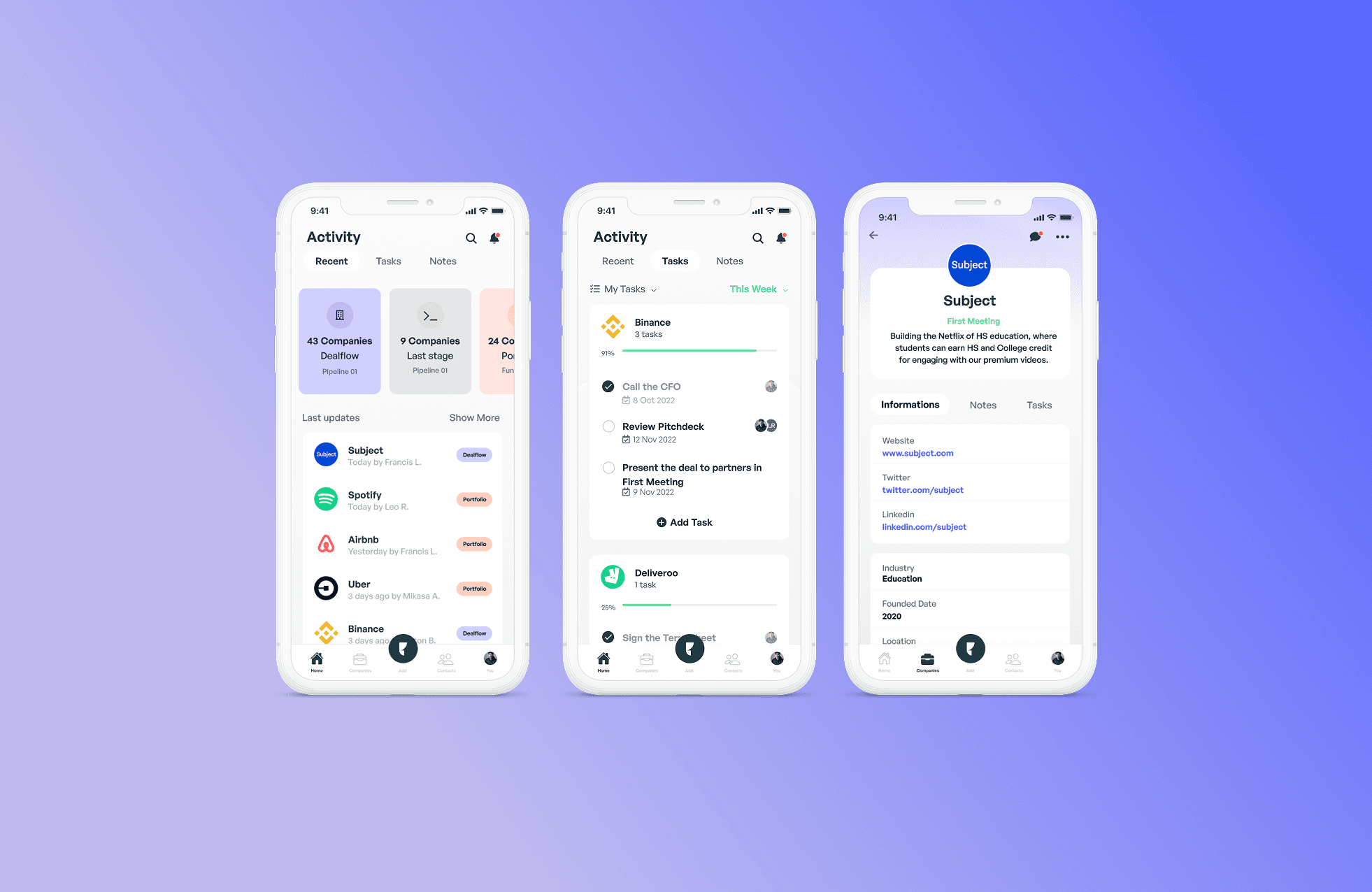
Rather than porting everything to mobile, we identified critical workflows: consulting deal details before a meeting, checking portfolio company metrics, adding notes after a conversation, scanning and uploading business cards. These use cases became the core of the mobile experience.
We created quick actions accessible in one tap from the home screen: 'Add Note', 'Scan Card', 'View Pipeline'. The most frequent tasks are accomplishable in less than 3 taps, even while walking or in a taxi.
Adaptive information architecture
For each screen, we rethought the visual hierarchy for mobile: most important metrics at the top, accessible without scrolling; secondary details collapsed in accordions or bottom sheets; simplified navigation in tabs rather than sidebar.
A deal on desktop shows everything: company info, financials, team, documents, timeline, notes. On mobile, the same page first shows the essential snapshot, and users can dive deeper into each section via expandable cards. The complete information is there, but the experience breathes.
Technical execution
Worked closely with engineering to optimize APIs and ensure performance across mobile contexts.
The application was developed in React Native, enabling scalable cross-platform delivery while maintaining product consistency.
Other projects/


Want to work together? /
I’m currently available for new collaborations; short or mid-term projects, full-time roles, or advisory work.
From product strategy to hands-on design and execution, I support teams across the entire product lifecycle.
If it sounds relevant, let’s set up a 30-minute call to explore fit.
