
Introduction & context
When Edda grew from a 5-person startup to an international team of 30+ collaborators distributed across three time zones, product consistency became a critical challenge. Each designer and developer worked with their own interpretations of patterns, creating fragmented experiences and dramatically slowing development.
The question was no longer 'how do we design this feature?' but 'how do we build a shared visual and technical language that would allow the team to scale without sacrificing quality?'
Problem & objectives
The symptoms of a product without a design system were everywhere: five subtle variations of the same button, inconsistent spacing, contradictory interaction patterns between sections. Developers constantly asked for clarifications, and each new feature took twice as long as it should.
Design system objectives:
Create a single source of truth for all components, patterns, and design principles
Reduce feature development time by 50% by providing ready-to-use components
Enable the team to scale while maintaining impeccable visual and functional consistency
Facilitate onboarding of new designers and developers by clearly documenting our standards
Solution description
System Architecture
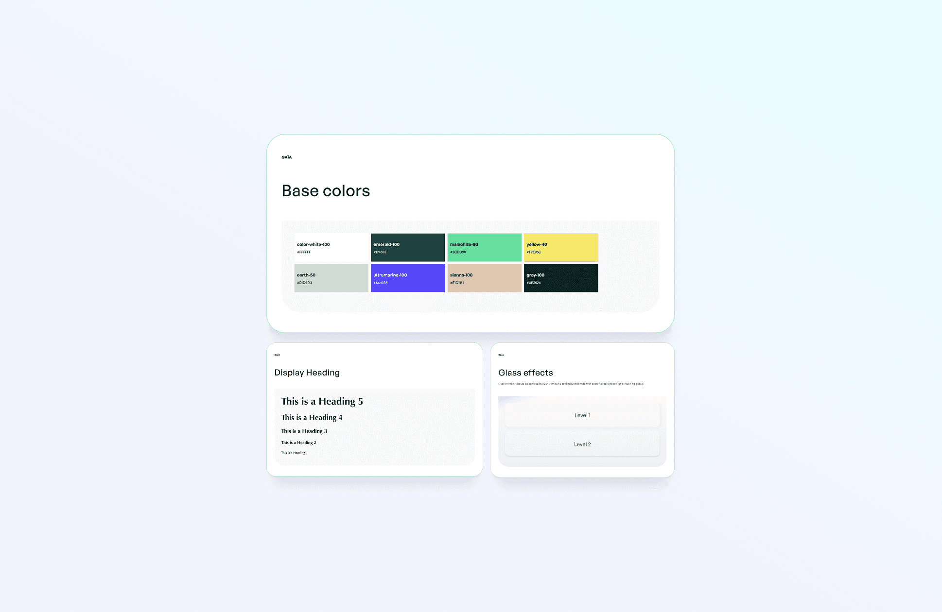
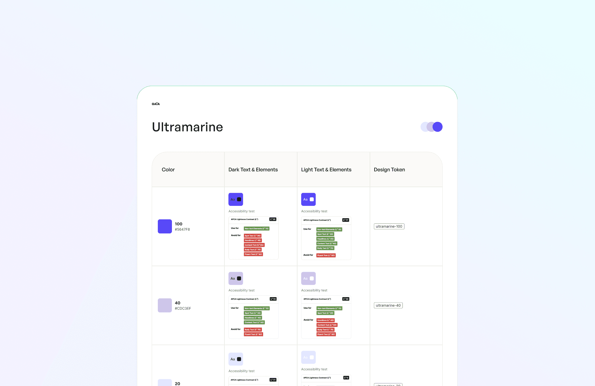
I structured the design system in three complementary layers: design tokens (colors, typography, spacing), base components (buttons, inputs, cards), and complex patterns (data tables, multi-step forms, deal workflows).
Each component was designed to be modular and composable. A simple 'Card' component can transform into 'DealCard', 'CompanyCard', or 'ContactCard' by adding appropriate props, avoiding proliferation of similar variants.
Living Documentation
Rather than static documentation, I created an interactive Storybook where each component is demonstrated in all its possible states. Designers and developers can see exactly how a button behaves in disabled, loading, or error states, and copy the corresponding code.
Each component includes clear usage guidelines: when to use it, when not to use it, and examples of visual do's and don'ts. This approach transformed documentation from an ignored chore into a constantly consulted resource.
Design-to-Dev Workflow
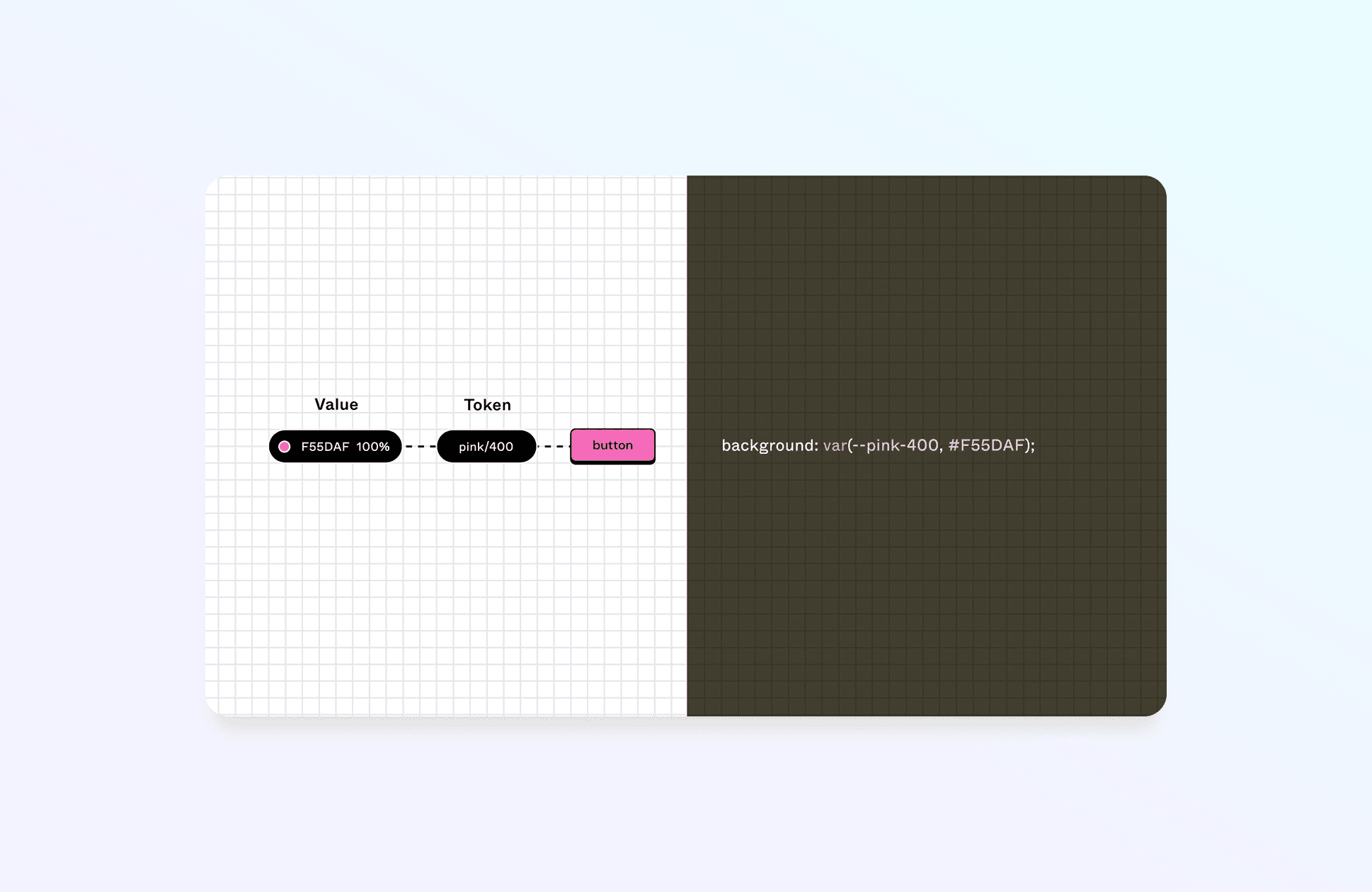
I established a direct bridge between Figma and code by using identical component names and a prop structure that reflects exactly between design and development. A designer using the 'Button variant="primary" size="large"' component in Figma knows the developer will use exactly the same code.
This synchronization eliminated countless back-and-forths and misunderstandings between design and engineering teams, dramatically accelerating the development cycle.
Other projects/


Want to work together? /
I’m currently available for new collaborations; short or mid-term projects, full-time roles, or advisory work.
From product strategy to hands-on design and execution, I support teams across the entire product lifecycle.
If it sounds relevant, let’s set up a 30-minute call to explore fit.
