
Context
As Head of Design at Edda, my responsibility extended beyond crafting beautiful interfaces. I was responsible for building and leading a design organization that could scale with the product; establishing design culture and processes that ensured quality without creating bottlenecks; and creating the conditions for designers to do their best work autonomously while maintaining consistency across a multi-product suite.
The challenge wasn't just about design craft; it was organizational. When Edda was 5 people, I could review every mockup, refine every detail, and ensure consistency through direct involvement. As we grew to 30+ people spread across three time zones, with six distinct platforms (Dealflow, Portfolio, CRM, Portal, mobile app, email plugins), that model became impossible. The question became: how do we scale design quality without scaling my involvement in every decision?
This wasn't a problem that could be solved with better project management or more designers. It required rethinking how design decisions get made, how quality is defined and measured, and how designers grow from executors into strategic partners who can make excellent decisions independently.
Problem & objectives
The symptoms of scaling pain were everywhere. Designs arrived in development meetings that felt unfinished; unclear whether they represented final specs or work-in-progress explorations. Engineers would implement what they saw, only to have designers ask for changes in QA. Back-and-forths multiplied. Features that should have taken two weeks stretched to five.
More troubling was the inconsistency. A new designer would create a modal dialog using a different pattern than our existing modals. Another would introduce a new shade of gray because they hadn't found the right token in our system. Features started to feel like they came from different products, not because designers lacked skill, but because we lacked shared language and clear standards.
I had become the bottleneck. Designers waited for my feedback before moving forward. Product managers checked with me before approving designs. Engineers asked me to clarify conflicting specs. Every decision funneled through me, and the organization's velocity suffered as a result.
My design leadership objectives:
Build a design organization that produces excellent work without requiring my review of every decision
Create a shared design language that enables consistency across six platforms and multiple designers
Establish clear quality standards that everyone understands and can evaluate against
Develop designers' skills and judgment so they can make strategic decisions independently
Create efficient design processes that maintain quality without slowing down product velocity
Design organization & culture
Building the design team
My first hire was critical. I needed someone who could operate independently on complex features while helping establish design standards. Rather than hiring for specific skill gaps (we need an icon designer, we need a prototyper), I hired for judgment and systems thinking; designers who naturally thought about how their work fits into a larger system.
But ownership without collaboration creates silos. We instituted weekly design reviews where each designer shared work-in-progress and received feedback from the team. These weren't approval gates; they were learning opportunities. A senior designer's suggestion on a junior's work educated everyone watching. Over time, the team developed a shared design sense.
Establishing design principles
Abstract principles like 'simple' or 'user-friendly' are useless for making design decisions. Everyone thinks their design is simple. We needed principles specific enough to guide real trade-offs.
My team and I developed principles through real design debates. When we disagreed about whether to add a feature to an already-complex screen, we'd dig into the underlying values: 'Dense but not cluttered' emerged as a principle, acknowledging that our users are professionals who value information density but still need clear visual hierarchy. 'Flexible without being complex' guided our approach to customization; powerful configuration options organized so most users never see them.
Each principle was documented with concrete examples: do's and don'ts, before-and-after comparisons, edge cases. Designers could consult these when making decisions independently, confident they were aligned with our design philosophy.
Design critique culture
Great design critique is hard. Done poorly, it's either too polite to be useful or so harsh it kills creativity. I worked to create a critique culture based on principles, not opinions.
The rule: we critique the design, not the designer. And every critique must reference either our design principles, user research findings, or platform consistency. 'I don't like this color' isn't feedback; 'this color doesn't meet our contrast ratio standards' is actionable. 'This feels cluttered' is vague; 'this screen has three visual hierarchies competing for attention, violating our clear hierarchy principle' identifies the problem.
These sessions became safe spaces for exploration. Designers would bring rough explorations, not pixel-perfect mockups, knowing the team would help them think through the hard problems. The junior designer who was stuck on a complex table interaction got input from someone who'd solved a similar problem in another product. The senior designer got challenged by a fresh perspective.
Design system & product consistency
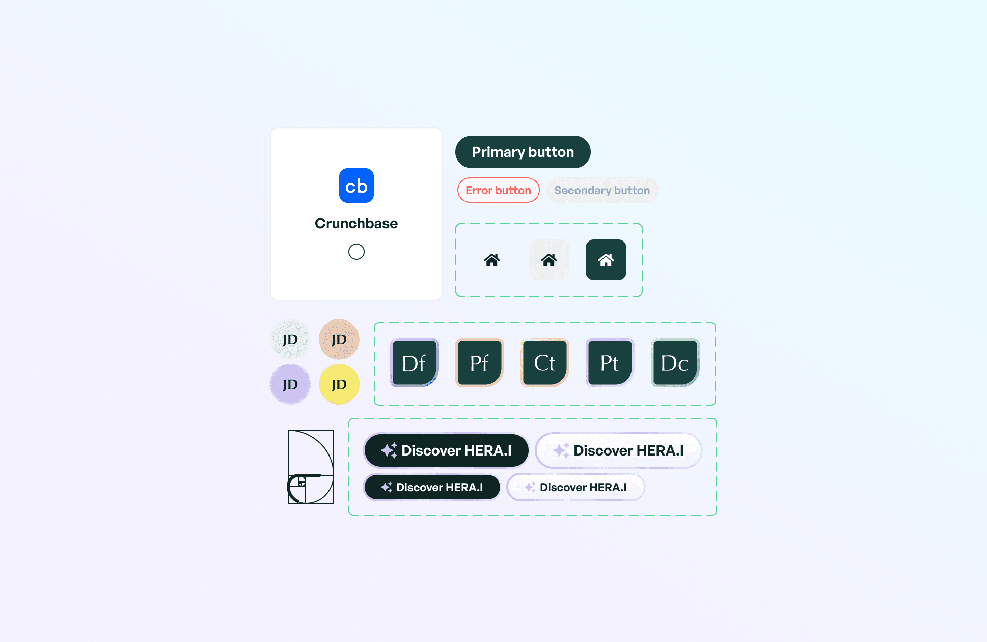
The foundation: design tokens
A design system isn't components; it's decisions. Before building any components, we needed to codify our foundational decisions: colors, typography, spacing, elevation, motion. These became our design tokens; the atomic building blocks of our visual language.
Rather than arbitrary color values, we created a semantic color system. 'Primary-500' didn't mean a hex value; it meant 'the main brand color at medium intensity.' This level of abstraction let us evolve the visual design without touching every component. When we updated our brand colors, we changed token values, and the entire product updated automatically.
The spacing system was particularly crucial. Instead of arbitrary margins and paddings, designers chose from a constrained scale: 4px, 8px, 16px, 24px, 32px, 48px, 64px. This created natural rhythm and made layouts feel cohesive even when designed by different people. A new designer couldn't accidentally introduce a 13px margin; the system didn't allow it.
Component library architecture
We structured our component library in three layers: primitives (buttons, inputs, cards), compositions (forms, data tables, empty states), and patterns (deal creation flows, portfolio dashboards). Each layer built on the one below, creating a composable system.
The key was making components flexible without making them complicated. A Button component had variants (primary, secondary, ghost) and sizes (small, medium, large), but not dozens of props for every possible customization. If a designer needed something that didn't fit our variants, that was a signal to discuss whether we needed a new variant or whether they were solving the wrong problem.
Each component was documented with usage guidelines: when to use it, when not to use it, accessibility considerations, responsive behavior. A designer creating a new form didn't need to ask how spacing should work or whether to use primary or secondary buttons; the documentation answered these questions.
Maintaining consistency across platforms
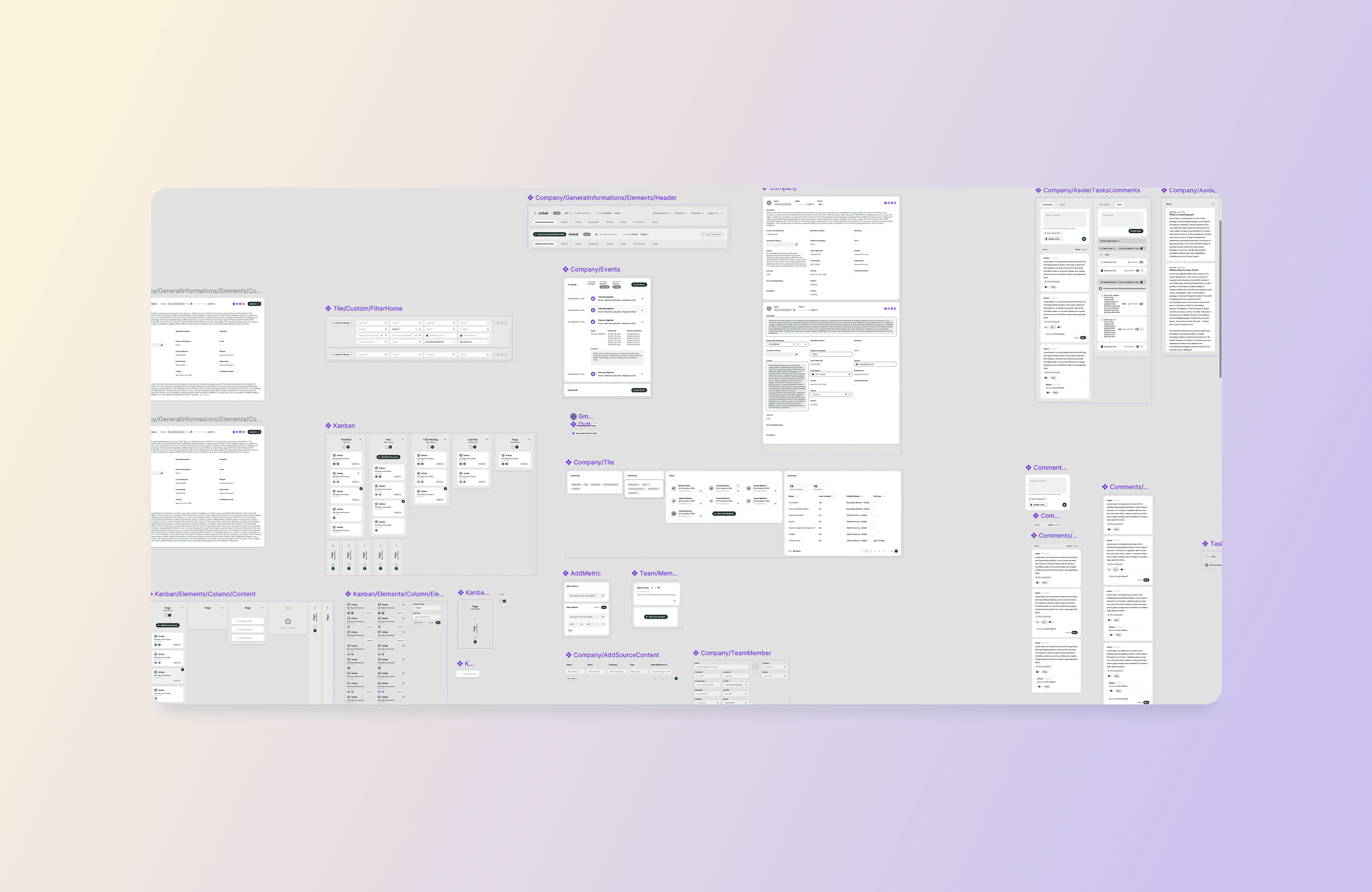
The hardest part of our design system was maintaining consistency across six platforms with different technical constraints. A Vue.js component in the web app couldn't be directly reused in the React Native mobile app or the Chrome extension email plugin.
My solution was design system documentation that transcended implementation. We documented components at the conceptual level: what problem does this component solve, what are its key behaviors, what are the design rules it must follow. Then each platform implemented it appropriately for their context.
A 'DealCard' component looked slightly different on mobile (touch targets, simplified information) than on web (hover states, more data density), but the core structure was consistent. Users recognized it as the same pattern adapted to different contexts, not different patterns that happened to serve similar purposes.
Brand transformation & repositioning
The rebrand challenge
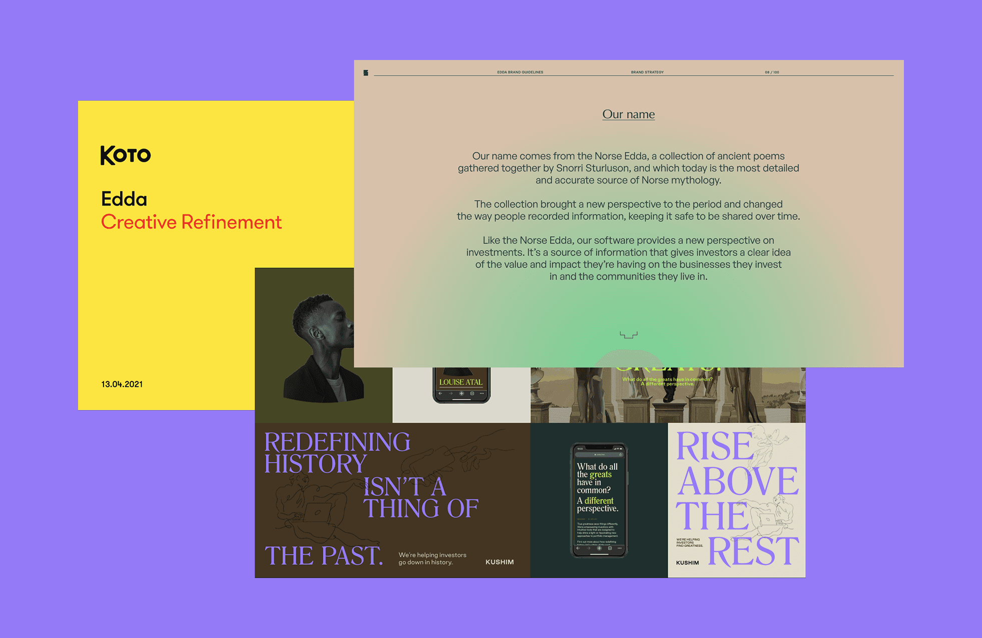
In 2023, as Edda matured from a startup into an established platform, our brand no longer matched our ambition. My team and I collaborated with international design studios Koto and FNDR to reimagine Edda's visual identity; a rebrand that needed to work across product, marketing, and external communications.
The challenge was integration. A brand identity created by external agencies can feel disconnected from the product unless carefully translated. I served as the bridge, ensuring the new brand wasn't just applied to the product as a skin but fundamentally integrated into how the product felt.
Translating brand to product
The rebrand introduced new typography, a refined color palette, and a more confident visual tone. But product design has constraints brand design doesn't: we needed accessibility compliance, dark mode support, states for every component (hover, active, disabled, loading), and patterns that worked at scale across hundreds of screens.
We developed a systematic approach: take each brand element (the new typeface, the color system, the illustration style) and translate it into product-ready specifications. The brand's elegant serif typeface became our marketing voice, while we chose a highly legible sans-serif for product interfaces. The brand colors were expanded into a complete UI palette with enough variations for every interface need.
The rollout was phased. We updated our design system first, then gradually rolled out the new brand to each product area, ensuring every screen met the new standards before shipping. This approach prevented a jarring 'big bang' redesign while ensuring consistent progress across the platform.
Aligning product, marketing, and brand
A common failure mode in rebrands is divergence: the marketing site looks polished with the new brand, while the product still uses old styles, creating a jarring experience when users sign up. I made it my mission to prevent this.
We created shared assets that both marketing and product could use: illustration libraries, icon sets, photographic styles. When marketing needed a feature screenshot for the website, they used actual product interfaces, not mocked-up versions. This ensured what users saw in marketing materials matched exactly what they'd see in the product.
The brand guidelines we developed weren't just for external use; they informed product decisions. When designing a new feature, we asked: does this feel like Edda? Does it match the confident, professional tone we established in the brand? The brand became a north star that aligned decisions across product, marketing, and customer communications.
Design delivery & performance
Structured design process
As the team grew, we needed a shared understanding of what 'done' meant at each stage of design. I established a four-phase process: discovery, definition, design, and delivery. Each phase had clear inputs, outputs, and success criteria.
Discovery involved user research, competitive analysis, and technical feasibility checks. We never moved to design without understanding the problem deeply. Definition meant writing clear problem statements and success metrics. What problem are we solving, for whom, and how will we know if we solved it? Only then did we enter design, creating solutions informed by research and constrained by reality.
The delivery phase was where many teams stumble. 'Design' isn't done when mockups are complete; it's done when the feature ships and meets quality standards. Designers remained involved through implementation, conducting design QA, adjusting details as technical constraints emerged, and ensuring the built experience matched the intended one.
Balancing discovery and execution
One of my key challenges was managing the team's time between exploration (discovering new opportunities, researching user needs) and execution (shipping designs for committed features). Too much discovery and we'd miss deadlines; too much execution and we'd build the wrong things efficiently.
We adopted a 70/30 split as a guideline. 70% of design time went to committed roadmap items; features we'd decided to build and needed to ship on schedule. 30% went to discovery: user research, explorations of future problems, design system improvements. This prevented us from becoming purely reactive while ensuring we met our commitments.
The 30% time was crucial for quality. It gave designers space to improve components they knew were subpar, conduct research that informed future quarters, and explore solutions to problems we'd encounter eventually. These investments in quality and knowledge paid dividends later when we could ship faster because we'd already thought through the hard problems.
Performance management and growth
I established quarterly objectives for each designer, aligned with both product priorities and their personal growth goals. A senior designer might own the redesign of a major product area while mentoring a junior. A mid-level designer might lead research for a new feature while improving specific design system components.
Performance reviews focused on craft, impact, and collaboration. Craft meant the quality of their design work: attention to detail, systems thinking, problem-solving creativity. Impact measured whether their work moved product metrics and solved real user problems. Collaboration assessed how they worked with PM, engineering, and other designers; their influence beyond their individual output.
Growth paths were individualized. Not every designer wanted to become a manager. Some grew into deep specialists, becoming the go-to expert for complex interaction design or data visualization. Others grew into design leadership roles, spending more time on systems thinking, mentoring, and design strategy. The key was creating room for designers to excel in ways that matched their strengths and interests.

Key results
Other projects/


Want to work together? /
I’m currently available for new collaborations; short or mid-term projects, full-time roles, or advisory work.
From product strategy to hands-on design and execution, I support teams across the entire product lifecycle.
If it sounds relevant, let’s set up a 30-minute call to explore fit.
